Clorox.com Design System
FCB West and Chicago offices worked together to create a whole new web experience for Clorox.com. I started with the project during the UX Discovery phase and my main responsibility was creating the design system. The wireframes were delivered in batches, whom I worked with my co-Art Director and Creative Director to create full-page layouts using Sketch Libraries. Live site is currently being developed.
Role: Product and Visual Design, Pattern Library Creation

Once the Creative Phase began, I started to pull colors from the master guidelines and the new Clorox campaign: What comes next is everything. We kept the same typeface, Larsseit Alt, and carried over the vibrant colors and imagery.

Several brand colors had to be tweaked for ADA compliance, especially to match the new print materials. The gradient palette, in particular, takes swatches from Clorox products and sits behind them on their detail pages.

Most headlines are presented in a bold, light blue color, effectively separating themselves from the Clorox Blue text links. Using a typography Sketch plugin made it easy to pass along type styles to my co-Art Director.

All elements were made to be responsive, with buttons being the most simple. Clorox Blue is used for primary buttons, making the button pop off the page against the vibrant palette.

The web experience was designed and delivered in three main sizes: Wide, Medium and Narrow. The fluid grid system is flexible enough for our responsive pattern library.

The previous Clorox system had chunky iconography that made the experience feel out-dated. I created a new Icon Library to reflect a stronger, cleaner look. Most icons are displayed on editorial pages or the Global Navigation.

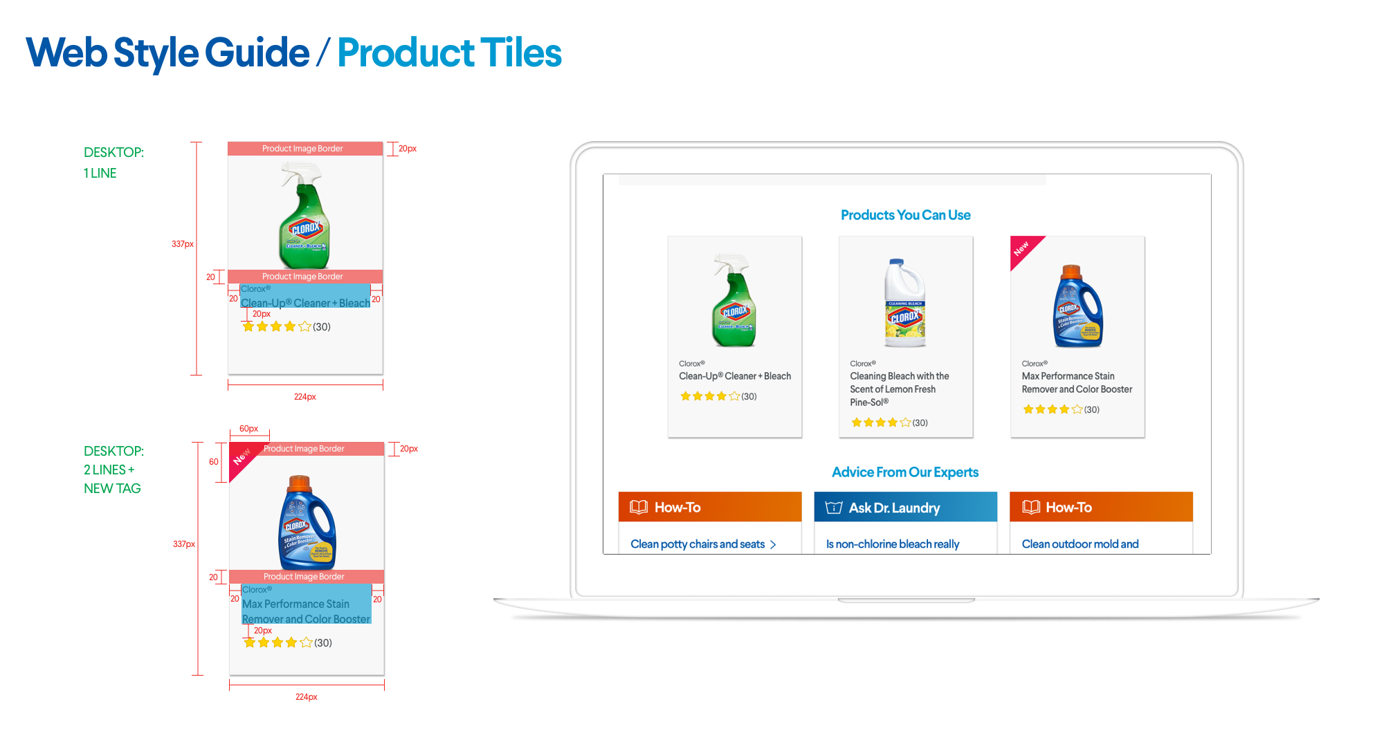
One major facelift we designed was the Product Tiles for every Clorox product. Because a lot of Products have 2-3 lines of text, the component had to be flexible enough to accommodate. Depending on the viewport, Product Tiles will take up three columns (Wide) or six (mobile.)


The Global Navigation was a team effort with my UX Designers. After card-sorting and re-organization of content, the new Navigation makes finding a product or How-To much faster. For desktop and tablet, the Navigation slides down over the content. On mobile, a full-page takeover is displayed.

The Global Footer has also been re-worked to showcase useful links and the Clorox family brand logos. On mobile, the links are collapsed into accordian drawers to keep content contained.

Part of the new brand strategy was to bring “thrive” to life through photography. When we were selecting photos to use throughout the site, diversity and “caught-in-the-moment” were our priority. Because Clorox is a family brand, it was important that every human was represented in their truest form.

Another major facelift was given to the "How To" section of the site. After stakeholder and customer interviews, it was clear that Clorox wants to be the go-to for search and stain removals. The "How To" Landing page and detail pages were created on a mobile-first layout, making sure content was easily scannable.

The "Article Listing" component was made on the fluid grid using either 12, 9 or 6 columns. Since most articles didn't have existing imagery, Sketch Libraries made the dynamic template easy to share with the development team.

Within the "How To" section, articles are either made by Clorox experts, Dr. Laundry or a guest/influencer. I created mini badges for each type to give each Article Listing a little personality. The color coding also followed to the Detail Pages within the title area.

The old Clorox.com has over 1,000 articles, which all needed to be converted to the new system. I worked with the UX Designers to create an Article Template, flexible for each article type, with or without imagery. On mobile, the gradient is suppressed in order to raise content for easier reading.

Each Article page also has a Sidebar component with dynamic data. Date, Views, Related Topic links and Social badges remain the same, while the Thumbs Up/Down section may or may not display a percentage. If the Article is written by a guest, their headshot and name will appear in the "About the Author" section.

Aside from Products and Articles, Clorox.com has many environmental and educational landing pages. I created Editorial Components to give visual life to the content blocks, utlitizing the fluid grid system.

The sexier components included Registering and User Sign In modals. On desktop, a user may encounter a Sign In modal while claiming coupons or leaving a review. On mobile, this modal will be a full-page takeover. To keep the experience less intrusive, imagery and gradients were not used to distract the user from completing their action.


The last template created was for the 404 pages, displaying a rotation of imagery and headlines. The two secondary buttons for Clorox.com Home and Product Hub were based on user testing where customers tend to click to route back.

